Responsive web design has changed a lot over the last few years. Front end development teacher, Nick Pettit updates you on all that’s changed when it comes to making websites work on mobile devices.
Responsive web design is a technique for building websites that work on mobile devices, tablets, and desktop screens. Not long ago, websites were typically designed specifically for laptop and desktop screen resolutions. This worked fine until the advent of web capable smart phones and tablets. Web designers approached the new challenge with a myriad of solutions, but the clear winner was Ethan Marcotte’s seminal article on Responsive Web Design back in May of 2010.
Responsive web design has changed a lot since then, and it even evolved in just the last two years since I wrote my beginner’s guide to responsive web design. Whether you’re totally new to web design or if you need to learn what’s new, this guide will help you catch up with the present.
What is Responsive Web Design?
For all that’s changed, it’s amazing how much has stayed the same. The basic principles of responsive web design that Ethan wrote in his article are just as relevant as ever.
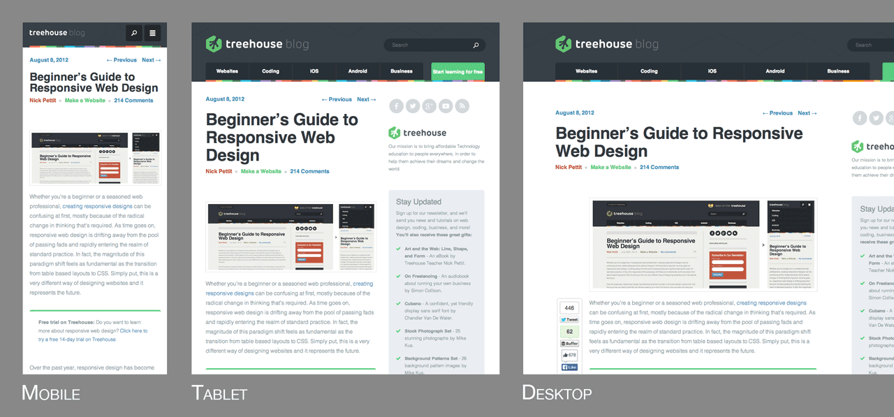
As I mentioned in the introduction, responsive web design solves the problem of making the same code work across multiple screen resolutions. Many modern websites are responsive, and in fact, the Treehouse Blog is one of them. If you resize your browser window, you’ll see the screen elements resize themselves like so:

There’s a myriad of web capable devices already available, and there are new form factors every day, so it’s impossible to target each individual screen. Instead, it’s better to let the website respond to its environment and adapt fluidly. One of my favorite quotes from Bruce Lee sums up this way of thinking.
“Empty your mind, be formless, shapeless — like water. Now you put water in a cup, it becomes the cup; You put water into a bottle it becomes the bottle; You put it in a teapot it becomes the teapot. Now water can flow or it can crash. Be water, my friend.”
– Bruce Lee
Practically speaking, this involves three main principles that come together to form the whole that is responsive design. They are:
- Fluid Grids
- Fluid Images
- Media Queries
Let’s take a look at each one in more detail.
FLUID GRIDS
Traditionally, websites have been defined in terms of pixels. This is an idea that was carried over from the print industry, where a magazine or a newspaper was always going to be the same fixed size. For better or worse, this is not how websites are displayed. Rather, a website might appear in a large format like on a television, or on a very small screen like a smartphone (or even a smartwatch). For this reason, responsive websites are built with relative units like percentages, rather than fixed units like pixels.
If you’re used to designing in pixels, there’s a simple math formula that can help you transition to using percentages. It looks like this:
target / context = result
For the sake of explanation, let’s say that you have a website that has a wrapper containing the site to a width of 960 pixels, and you’re looking at this site in a maximized browser window on a screen that’s 1920 pixels wide. In this case, the width of the browser window is the context and the wrapper is the target. In order for the site to look exactly the same, you can divide the target by the context to get a percentage value.
960px / 1920px = 50%
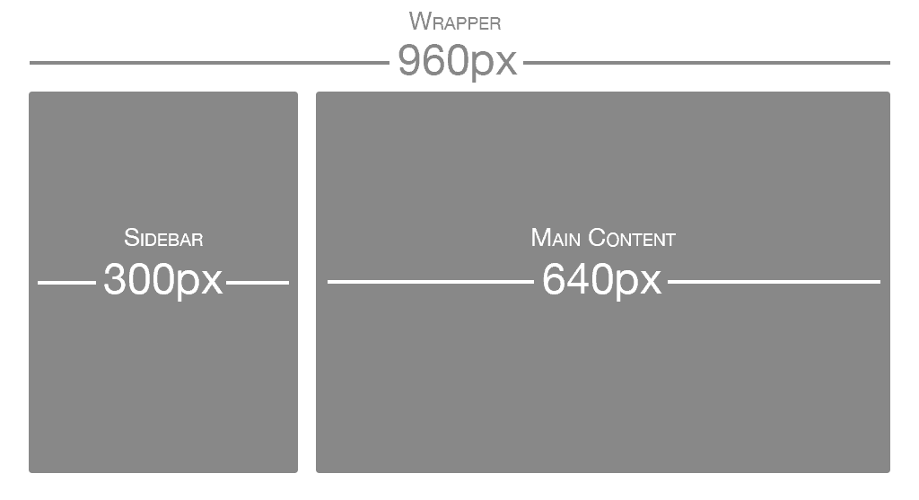
Now, what about child elements that are nested inside the wrapper element? The same rule applies all the way down. As another example, let’s say that you have a two column layout inside of your 960px wide site. The left column is a sidebar that’s 300px wide and the right column is the main content area at 640px wide. You also want 20px of margin between the two columns. Here’s an image illustrating what that might look like:

Using the same formula, each part of the site would have the following values:
- Sidebar: 300px / 960px = 31.25%
- Main Content: 640px / 960px = 66.66667%
- Margin: 20px / 960px = 2.08334%
These percentage values can then be used in CSS simply by applying them to the width, margin, and padding properties. Here’s an example I created on CodePen demonstrating what that might look like in HTML and CSS.
FLUID IMAGES
There have been many advances in responsive images (detailed later in this post), but the core idea is that images should be able to shrink within the confines of a fluid grid. This can be done very simply with a single line of CSS code:
img { max-width: 100%; }
This will tell the browser that any images should only ever be as large as their pixel value, which will ensure that the image is never stretched or pixelated. However, if they’re nested inside a parent container that’s smaller than their pixel value, then the image should shrink. So for example, if an image with a width of 800px is placed inside a container that’s only 600px wide, the image will also shrink to be 600px wide. The height will be calculated automatically and will maintain the original aspect ratio.
MEDIA QUERIES
If you take our original two column layout and try to shrink it down to a mobile phone, it’s a bit challenging. Typically smartphones are used in portrait mode, meaning that the screen is taller than it is wide. This lends itself to websites that scroll vertically, but it’s not good for wide layouts with several columns. That’s where media queries come in. Media queries are a CSS technology that have been available in browsers for several years now, and they’re a core component of responsive design. Media queries allow CSS to only be applied when specific conditions are met. For example, you could write a media query that will only applies CSS if the browser reaches a specific width. That means that when a design is too large or too small, a media query can be used to detect the site width and serve CSS that appropriately rearranges the site’s content. Using the previous two column layout as an example, let’s say that we want to move the sidebar up to the top on mobile screen sizes. It’s actually better to do this by creating the mobile styles first and then using the media query to apply styling for the larger size (this is called a mobile first approach, which we’ll dig into more in a moment). The media query to do that might look like this:
@media screen and (min-width: 600px) { /* ...desktop styles here... */ }
Additionally, here’s a modified version of the previous CodePen embed so that you can see what this looks like in context. Please note that unless you resize your browser window to a smaller screen size (or you’re on a mobile device) this will look the same as the previous example.
See the Pen Basic Mobile First Design Example by Nick Pettit (@nickpettit) on CodePen.
At a certain point, any fluid grid layout will start to “break” and no longer look good. For example, if a mobile layout that takes up 100% of the browser width were stretched to a desktop size, the space wouldn’t be very well utilized. The point at which a layout no longer looks good is called a breakpoint. Responsive sites define their breakpoints through a series of media queries. In general, responsive code might look something like this
/* ...mobile styles here... */
@media screen and (min-width: 600px) { /* ...tablet styles here... */ }
@media screen and (min-width: 900px) { /* ...desktop styles here... */ }
This is just a small example. In practice, you might have many more media queries at sizes that are appropriate for your content. While I recommend using your site’s content as a guide for creating these breakpoints, screensiz.es has the best listing I’ve seen of device resolutions, just in case you need it.
Mobile First
Even before the start of the responsive design revolution, the idea of using a “mobile first” approach started to take hold. Mobile first is the idea of designing the smartphone experience first and then working upwards to tablets, desktops, and possibly beyond. In the now famous Mobile First post from Luke Wroblewski, there are several reasons given:
- Mobile web browsers represent a rapidly growing demographic and will likely eclipse desktop browsing (if it hasn’t happened already)
- Small mobile screen sizes force designers to focus, because there’s no room for sidebars, ads, social media buttons, and other peripheral content
- Mobile devices typically have more capabilities than their desktop counterparts, such as touchscreens, GPS, accelerometer data, and more
Designing a responsive site with a mobile first approach is a natural evolution of both ideas. As demonstrated in the previous example, it can be tricky to cram a multi-column layout into a smaller screen space. Instead, it’s much better to start simple, then work upwards to more complex designs. In fact, creating a mobile experience first may benefit the desktop layouts as well, because the user experience will naturally be more focused.
Responsive Front-End Frameworks
Front-end frameworks like Foundation and Bootstrap have been around for some time, but more recently they’ve become responsive frameworks. In other words, their grids have responsive design in mind from the start. This is a huge step forward, because most of the time you don’t need to do any fluid grid calculations at all. Rather, the responsive grids included with a modern front-end framework just works immediately.
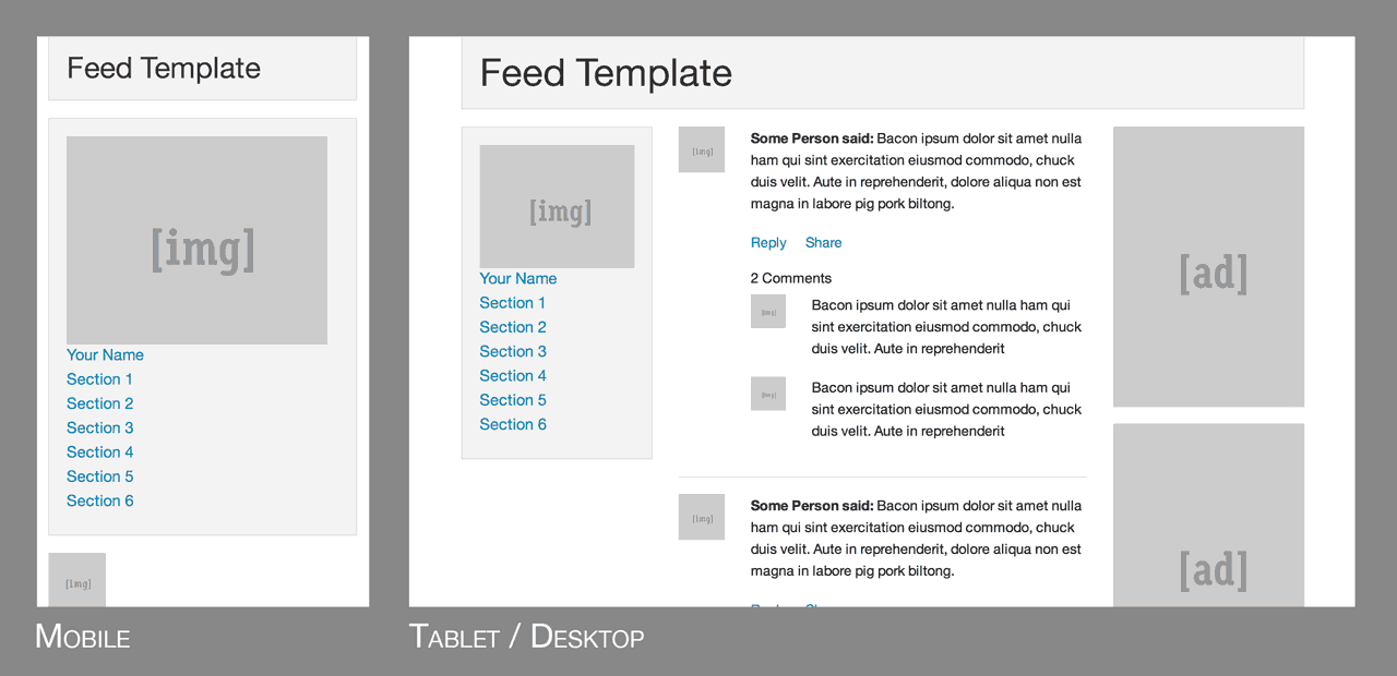
As an example, take a look at this template from Foundation:

Unless you’re building an extremely simple 1-page website, it’s almost always a smart idea to pick a front-end framework to start out with, even if it’s just for rapid prototyping. The responsive grids in these frameworks are very robust and thoughtful, so there’s no need to “reinvent the wheel” and start over.
Responsive Images
Beyond just multiple screen resolutions, web designers now have the added challenge of multiple pixel densities. Phones, tablets, laptops, and even some desktops, might have 2x or even 3x the number of pixels. In my own opinion, I think the best way to handle high DPI displays is to use an SVG first approach. In other words, anything that’s not a detailed photograph or illustration should be an SVG, because they can scale to any resolution and the file sizes are typically small.
If photographs or any kind of JPEG images are required (and they almost always are), typically you can get away just making them twice the size of their parent container. So for example, if the parent is 400 pixels wide, the image inside should be at least 800 pixels wide. This same trick works for background images when the background-size property is set to 50% or less.
However, if you need something more robust for lots of images, it’s worth investigating newer responsive image solutions. The Responsive Images Community Group has been working towards a client-side solution that comes in the form of both the <picture> element and the srcset attribute for the <img>element. Browser support is still far off, but they also offer a JavaScript polyfill that lets you use these features today.

