Writing middleware for use in Express apps

Overview

Middleware functions are functions that have access to the request object (req), the response object (res), and the next function in the application’s request-response cycle. The next function is a function in the Express router which, when invoked, executes the middleware succeeding the current middleware.

Middleware functions can perform the following tasks:

  • Execute any code.
  • Make changes to the request and the response objects.
  • End the request-response cycle.
  • Call the next middleware in the stack.

If the current middleware function does not end the request-response cycle, it must call next() to pass control to the next middleware function. Otherwise, the request will be left hanging.

The following figure shows the elements of a middleware function call:

HTTP method for which the middleware function applies.
Path (route) for which the middleware function applies.
The middleware function.
Callback argument to the middleware function, called “next” by convention.
HTTP response argument to the middleware function, called “res” by convention.
HTTP request argument to the middleware function, called “req” by convention.

Example

Here is an example of a simple “Hello World” Express application. The remainder of this article will define and add two middleware functions to the application: one called myLogger that prints a simple log message and another called requestTime that displays the timestamp of the HTTP request.

var express = require('express')
var app = express()

app.get('/', function (req, res) {
  res.send('Hello World!')
})

app.listen(3000)

Middleware function myLogger

Here is a simple example of a middleware function called “myLogger”. This function just prints “LOGGED” when a request to the app passes through it. The middleware function is assigned to a variable named myLogger.

var myLogger = function (req, res, next) {
  console.log('LOGGED')
  next()
}

Notice the call above to next(). Calling this function invokes the next middleware function in the app. The next() function is not a part of the Node.js or Express API, but is the third argument that is passed to the middleware function. The next() function could be named anything, but by convention it is always named “next”. To avoid confusion, always use this convention.

To load the middleware function, call app.use(), specifying the middleware function. For example, the following code loads the myLoggermiddleware function before the route to the root path (/).

Read Full Article

Angular 2.0 Final Release Now Live!

Develop Across All Platforms

Learn one way to build applications with Angular and reuse your code and abilities to build apps for any deployment target. For web, mobile web, native mobile and native desktop.

Speed & Performance

Achieve the maximum speed possible on the Web Platform today, and take it further, via Web Workers and server-side rendering.

Angular puts you in control over scalability. Meet huge data requirements by building data models on RxJS, Immutable.js or another push-model.

Incredible Tooling

Build features quickly with simple, declarative templates. Extend the template language with your own components and use a wide array of existing components. Get immediate Angular-specific help and feedback with nearly every IDE and editor. All this comes together so you can focus on building amazing apps rather than trying to make the code work.

Loved by Millions

From prototype through global deployment, Angular delivers the productivity and scalable infrastructure that supports Google’s largest applications.

Shopify makes it easy to build online store

All the features you want, none of the hassle

100+ professional themes

With themes created by world-renowned designers like Happy Cog, Clearleft, and Pixel Union, you’ll love how your website looks on Shopify.

Browse the Shopify Theme Store.

Mobile commerce ready

Your online Shopify store includes a built-in mobile commerce shopping cart. Your customers can browse and buy from your store using any mobile phone or tablet.

Work with an expert

You can work with one of our Shopify Experts to customize your store from the ground up.

Find a Shopify Expert.

Full blogging platform

Publish and categorize articles, create lookbooks, encourage discussion, and moderate comments on your Shopify blog.

Edit HTML and CSS

You have full access to the HTML and CSS of your store, making it easy to customize every aspect of your website.

Brand and customize your online store

Every template comes with its own intuitive settings so you can quickly and easily customize every facet of your storefront.

Your own domain name

Use your own domain name, or purchase one through Shopify.

Web-based website builder

Host your entire website on Shopify. Your online store comes with a full-featured content management system.

A Shopify store being displayed on an iPhone and laptop

Free SSL certificate

Every Shopify store includes a free 256-bit SSL certificate. All pages, content, credit card, and transaction information is protected by the same level of security used by banks.

70 payment gateways

From bitcoin to PayPal to iDEAL, Shopify integrates with over 70 external payment gateways from around the world.

Find a payment gateway in your country.

Offer free shipping

Improve your average order size by offering free shipping to your customers. You can choose the price point at which free shipping applies.

Multiple languages

Your online store checkout comes in 50+ languages, and you can always translate your store’s theme to suit your needs.

Automatic carrier shipping rates

Receive automatic shipping rates from major shipping carriers like UPS, USPS, and FedEx.

Abandoned checkout recovery

Recover lost sales by automatically sending an email to prospective customers with a link to their abandoned shopping carts, encouraging them to complete their purchase.

Flexible shipping rates

Set up shipping rates by fixed-price, tiered pricing, weight-based, and location-based rates.

Automatic taxes

Based on your location, Shopify will automatically handle major country and state tax rates.

Read More….

Four Ways To Build A Mobile Application

This is the third installment in a series covering four ways to develop a mobile application. In previous articles, we examined how to build a native iOS and native Android tip calculator. In this article, we’ll create a multi-platform solution using PhoneGap.

Adobe’s PhoneGap platform enables a developer to create an app that runs on a variety of mobile devices. The developer accomplishes this largely by writing the user interface portion of their application with Web technologies such as HTML, CSS and JavaScript. PhoneGap’s development tools then bundle the HTML, CSS and JavaScript files into platform-specific deployment packages. PhoneGap supports a wide variety of platforms:

  • iOS
  • Android
  • Windows 8
  • Windows Phone 7 and 8
  • BlackBerry 5.x+
  • WebOS
  • Symbian
  • Tizen

For this article, we’ll focus on getting our sample FasTip application running on iOS and Android:

As with the previous articles in this series, all of the code for our application may be obtained from a GitHub repository.

Applications built with PhoneGap use the mobile platform’s Web view to render content. As such, the content will appear nearly identical on each platform, much as any Web page would. While you can style the controls differently on each platform, take care in doing this. This issue is covered in detail in the section below on multi-platform considerations.

Plugins: Closing The Gap On Native Features Link

PhoneGap essentially wraps a Web view of your HTML, CSS and JavaScript in a native application. This is required because the Web view in an application does not inherently support many device features, such as access to the file system or the camera. PhoneGap has a bridging mechanismthat allows JavaScript running in the Web view to invoke native code contained in the application. PhoneGap comes complete with plugins to support device capabilities such as the following:

  • accelerometer,
  • camera,
  • contacts,
  • file system,
  • media playback and recording,
  • network availability.

A full list of capabilities for each platform is available on PhoneGap’s website. If these capabilities aren’t enough, PhoneGap may be extended with plugins that enable the developer to access more device features, including these:

  • barcode scanning,
  • Bluetooth,
  • push notifications,
  • text to speech,
  • calendars,
  • Facebook Connect.

In previous versions of PhoneGap, a GitHub repository contained a set of prebuilt plugins. With the arrival of PhoneGap 3, a new plugin architecture has resulted in the old repository being deprecated. A registry has been created for all plugins compatible with PhoneGap 3.

Some command-line tools are also provided to make it easy to add the plugins to the repository for your project. We’ll see these later on in this article. PhoneGap also publishes documentation and examples on how to write your ownplugins. Of course, development of plugins assumes familiarity with the native platform on which the plugin is to be supported.

An HTML, CSS And JavaScript Foundation For Mobile Development Link

The majority of PhoneGap’s capabilities lie in non-visual components — things that access the file system, network availability, geolocation, etc. PhoneGap does not provide much assistance with building the user interface itself. For this, you must rely on the HTML and CSS foundation that you’ve built yourself or on a framework. Applications written for mobile browsers must respect the limitations of the given mobile platform (processing speed, screen size, network speed, touch events, etc.).

Unless you have been working with HTML and CSS for a long time and are well aware of these issues, developing an effective mobile application without some sort of framework can be daunting.

Fortunately, some mobile frameworks have arisen to helpwith this. Here are just some of the offerings in this area:

These frameworks vary from CSS-oriented libraries (like Topcoat) to complete MVC-based libraries with sets of mobile UI controls (like Sencha Touch). Discussing the differences between these frameworks in detail is beyond the scope of this article and would require an entire series of articles. Visit the websites above and try some of the demonstrations on several mobile devices.

One distinction to be made is that some frameworks support a wider variety of devices and device versions than others. Some mobile frameworks are built on a particular MVC platform. For example, Ionic is built on the AngularJS framework. This might make a particular library more attractive to developers who are already familiar with the respective MVC framework.

Frameworks such as Sencha Touch abstract the DOM from the developer through the use of APIs, freeing the developer from having to worry about details of browser vendor implementations. Sencha also provides graphic development tools, such as Sencha Architect, to aid the development process. Sencha provides commercial support and training, too, which are worth investigating.

I’m often asked to recommend a framework for mobile development. But the right tool depends largely on your application’s functionality, the mobile platforms you need to support, your demand for commercial support and your experience with Web and mobile development in general. I’m encouraged by some emerging frameworks, particularly Ionic, but as of the time of writing, Ionic is still in the alpha stage. If you are looking for something with a longer track record, then Sencha Touch or, for some cases, jQuery Mobile might be appropriate.

To be expedient and because of the wealth of tutorials and documentation available, I’ve written our FasTip application in jQuery Mobile, which provides a wide range of support for mobile devices. It’s a good choice for applications that do not require significant customization to the user interface. The simplicity of our application makes it well suited to jQuery Mobile.

Powered by HTML5 and Kendo UI to build fast and responsive PHP apps

Key Features

  •  Complete Web Development Framework

    Telerik UI for PHP is a complete framework for building modern HTML5 web and mobile apps using PHP.

  • 40+-jQuery-based-UI-widgets-with-PHP-server-wrappers

    UI Widgets With PHP Server Wrappers

    Telerik UI for PHP contains 70+ jQuery-based UI widgets for building sites and mobile apps with JavaScript and HTML5 and 40+ PHP server wrappers
  • Easily_customize_themes_to_match_your_site_and_app's_look&feel

    Customize Themes

    When the out-of-the-box themes are not enough, you can use the ThemeBuilder tool to quickly customize the base styles to perfectly match your site.

    SEE MORE

Responsive Web Design: What It Is and How To Use It

Almost every new client these days wants a mobile version of their website. It’s practically essential after all: one design for the BlackBerry, another for the iPhone, the iPad, netbook, Kindle — and all screen resolutions must be compatible, too. In the next five years, we’ll likely need to design for a number of additional inventions. When will the madness stop? It won’t, of course.

In the field of Web design and development, we’re quickly getting to the point of being unable to keep up with the endless new resolutions and devices. For many websites, creating a website version for each resolution and new device would be impossible, or at least impractical. Should we just suffer the consequences of losing visitors from one device, for the benefit of gaining visitors from another? Or is there another option?

Responsive Web design is the approach that suggests that design and development should respond to the user’s behavior and environment based on screen size, platform and orientation. The practice consists of a mix of flexible grids and layouts, images and an intelligent use of CSS media queries. As the user switches from their laptop to iPad, the website should automatically switch to accommodate for resolution, image size and scripting abilities. In other words, the website should have the technology to automaticallyrespond to the user’s preferences. This would eliminate the need for a different design and development phase for each new gadget on the market.

The Concept Of Responsive Web Design

Ethan Marcotte wrote an introductory article about the approach, “Responsive Web Design,” for A List Apart. It stems from the notion of responsive architectural design, whereby a room or space automatically adjusts to the number and flow of people within it:

“Recently, an emergent discipline called “responsive architecture” has begun asking how physical spaces can respond to the presence of people passing through them. Through a combination of embedded robotics and tensile materials, architects are experimenting with art installations and wall structures that bend, flex, and expand as crowds approach them. Motion sensors can be paired with climate control systems to adjust a room’s temperature and ambient lighting as it fills with people. Companies have already produced “smart glass technology” that can automatically become opaque when a room’s occupants reach a certain density threshold, giving them an additional layer of privacy.”

Transplant this discipline onto Web design, and we have a similar yet whole new idea. Why should we create a custom Web design for each group of users; after all, architects don’t design a building for each group size and type that passes through it? Like responsive architecture, Web design should automatically adjust. It shouldn’t require countless custom-made solutions for each new category of users.

Obviously, we can’t use motion sensors and robotics to accomplish this the way a building would. Responsive Web design requires a more abstract way of thinking. However, some ideas are already being practiced: fluid layouts, media queries and scripts that can reformat Web pages and mark-up effortlessly (or automatically).

But responsive Web design is not only about adjustable screen resolutions and automatically resizable images, but rather about a whole new way of thinking about design. Let’s talk about all of these features, plus additional ideas in the making.

Adjusting Screen Resolution

With more devices come varying screen resolutions, definitions and orientations. New devices with new screen sizes are being developed every day, and each of these devices may be able to handle variations in size, functionality and even color. Some are in landscape, others in portrait, still others even completely square. As we know from the rising popularity of the iPhone, iPad and advanced smartphones, many new devices are able to switch from portrait to landscape at the user’s whim. How is one to design for these situations?


In addition to designing for both landscape and portrait (and enabling those orientations to possibly switch in an instant upon page load), we must consider the hundreds of different screen sizes. Yes, it is possible to group them into major categories, design for each of them, and make each design as flexible as necessary. But that can be overwhelming, and who knows what the usage figures will be in five years? Besides, many users do not maximize their browsers, which itself leaves far too much room for variety among screen sizes.

Morten Hjerde and a few of his colleagues identified statistics on about 400 devices sold between 2005 and 2008. Below are some of the most common:


Since then even more devices have come out. It’s obvious that we can’t keep creating custom solutions for each one. So, how do we deal with the situation?

PART OF THE SOLUTION: FLEXIBLE EVERYTHING

A few years ago, when flexible layouts were almost a “luxury” for websites, the only things that were flexible in a design were the layout columns (structural elements) and the text. Images could easily break layouts, and even flexible structural elements broke a layout’s form when pushed enough. Flexible designs weren’t really that flexible; they could give or take a few hundred pixels, but they often couldn’t adjust from a large computer screen to a netbook.

Now we can make things more flexible. Images can be automatically adjusted, and we have workarounds so that layouts never break (although they may become squished and illegible in the process). While it’s not a complete fix, the solution gives us far more options. It’s perfect for devices that switch from portrait orientation to landscape in an instant or for when users switch from a large computer screen to an iPad.

In Ethan Marcotte’s article, he created a sample Web design that features this better flexible layout:


The entire design is a lovely mix of fluid grids, fluid images and smart mark-up where needed. Creating fluid grids is fairly common practice, and there are a number of techniques for creating fluid images:

For more information on creating fluid websites, be sure to look at the book “Flexible Web Design: Creating Liquid and Elastic Layouts with CSS” by Zoe Mickley Gillenwater, and download the sample chapter “Creating Flexible Images.” In addition, Zoe provides the following extensive list of tutorials, resources, inspiration and best practices on creating flexible grids and layouts: “Essential Resources for Creating Liquid and Elastic Layouts.”

While from a technical perspective this is all easily possible, it’s not just about plugging these features in and being done. Look at the logo in this design, for example:


If resized too small, the image would appear to be of low quality, but keeping the name of the website visible and not cropping it off was important. So, the image is divided into two: one (of the illustration) set as a background, to be cropped and to maintain its size, and the other (of the name) resized proportionally.

<h1 id="logo"><a href="#"><img src="site/logo.png" alt="The Baker Street Inquirer" /></a></h1>

Above, the h1 element holds the illustration as a background, and the image is aligned according to the container’s background (the heading).

This is just one example of the kind of thinking that makes responsive Web design truly effective. But even with smart fixes like this, a layout can become too narrow or short to look right. In the logo example above (although it works), the ideal situation would be to not crop half of the illustration or to keep the logo from being so small that it becomes illegible and “floats” up.

5 Tips For Online Reputation Management By Using Social Media & SEO

Online Reputation Management (ORM) is a key player in setting up the brand name & boosting the business revenue. It is the most important factor that every business should consider because today, many people use different websites in order to search about the business. If they find anything that reflects the brand reputation in bad light, then they leave that business website and choose another.

At present, all the businesses are busy in improving their productivity and sale, but they mostly forget that without good brand reputation, it is not possible to attract people toward the business. Therefore, here this blog points out some simple tips and online reputation consultants’ recommendations that help you do ORM by using Social Media and SEO technique.

Let’s explore all Online Reputation Management tips:

1. Cover Maximum Web Pages Under Your Business Name

Create fan page and register your brand name at all the social networking websites in order to make your business visible. Moreover, you should create a blogging page, where you post the informative content every day. Try to build relationship with the influencers, (who own the audience that are suitable for your business) by promoting their contents. It is better, if you share your content at the most authority website.

The another important thing that everyone should consider is, maintaining consistency in all the contents. Consistency in every online content is essential as it can ease the way for the visitors to remember the business image.

Expert’s Review

Reach to all the social networking & community platforms and try to be in touch with the like-minded audience & influencers by sharing the contents frequently. All these efforts will contribute to boost your search results.

2. Monitor Mentions Through Tools

Nowadays, there are various software applications available that can not only help you track the ranking of your brand name, but also automatically notify you about the mentions. In this way, it will save your valuable time and ease the management process. The tool like Google Alert is the best example of this. Here, the users just need to enter the keyword/name and the email, then this tool will automatically send the mentions to the email. Apart from this tool, Trackur and Mention.net are the advanced and premium applications that enable the users to track the mentions easily.

Expert’s Review

Software applications have automated various parts of the businesses. Now, the professional does not need to sit in front of desktop to track the website. The software application can track the changes occurred in the website and inform the webmasters on real time basis.

3. Interact With New Audience

Reach to new audience by sharing informative content at the most authority websites. In order to boost this process, you should take the help of content marketing, press releases, guest blogging, and other media. In this way, you can bring authority to your business name and brand.

Expert’s Review

Reap off the power of the internet, use the guest blogging, press releases, digital media and other sources to reach new audience and expand your space in the online marketplace. This will boost the authority of your business website. 

How to Optimize Your Single Page Website

What happens when your client decides to create a single page website and ask you to optimize it rather than going with the usual multiple-page architecture? Well, you find yourself in a predicament! It is because if you are not that well-versed with single-page web optimization, you’re sure to end up plucking your hair out of frustration.

After all, one-page websites have always been the victim of non-paginated structures, content relevancy and whatnot! Hence, due to the unfamiliarity with the optimization of such website, people preferred to drop the “CHANGE” all together and opt for the traditional site architecture.

However, things have changed now! Since the search engine giant, Google, has now become more developed, intelligent and smart over the years, it has finally acknowledged the existence of single-page websites. Consequently, it has done some updates to its crawlers and algorithms, which is why we are seeing a plethora of well-designed and well -ranked one-page websites on SERP, these days.

In this article, I’ll give you a detailed tour of what goes behind the optimization of these websites and how you too can get started. Let’s see:

Pagination is The Way to Go

Googlebots, aka web crawlers, tend to favor the paginated structure, which a multi-page, i.e., conventional website already supports by default. But, how do we restructure the format of a one-page website? By making sure that we don’t leave our site without any organized pagination.

To paginate the structure of your page, you need to create clear and distinct sections, each of which serving a specific purpose. This also makes navigation a lot easier. Plus, you may define a suitable keyword to each section and optimize it for that section. For instance, you may use a keyword for a specific section’s headline or h1 tag, body content (copy), image alt tag, etc. and use a different keyword for the second section’s content, and so on.

Employ DIVs to Paginate Content

The best way you may go about separating and classifying each section on a one-page site is by assigning a separate <div>.

Guide to Responsive Web Design

Responsive web design has changed a lot over the last few years. Front end development teacher, Nick Pettit updates you on all that’s changed when it comes to making websites work on mobile devices.

Responsive web design is a technique for building websites that work on mobile devices, tablets, and desktop screens. Not long ago, websites were typically designed specifically for laptop and desktop screen resolutions. This worked fine until the advent of web capable smart phones and tablets. Web designers approached the new challenge with a myriad of solutions, but the clear winner was Ethan Marcotte’s seminal article on Responsive Web Design back in May of 2010.

Responsive web design has changed a lot since then, and it even evolved in just the last two years since I wrote my beginner’s guide to responsive web design. Whether you’re totally new to web design or if you need to learn what’s new, this guide will help you catch up with the present.

What is Responsive Web Design?

For all that’s changed, it’s amazing how much has stayed the same. The basic principles of responsive web design that Ethan wrote in his article are just as relevant as ever.

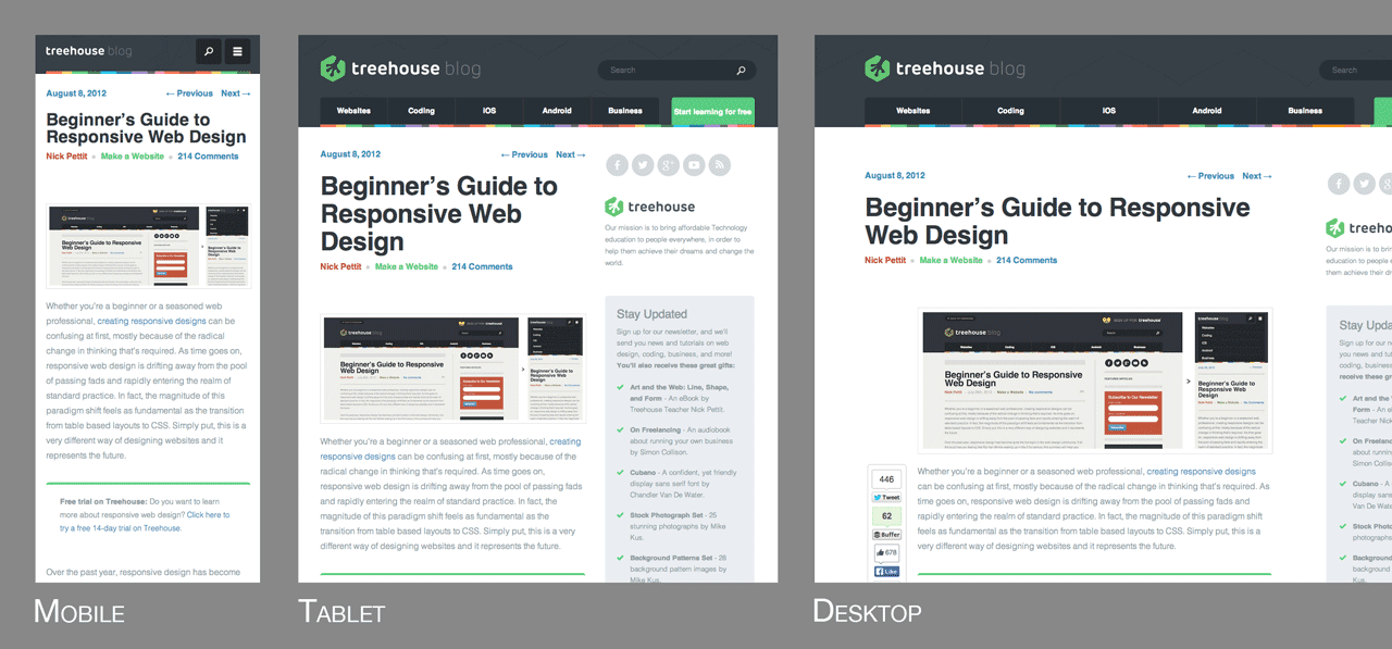
As I mentioned in the introduction, responsive web design solves the problem of making the same code work across multiple screen resolutions. Many modern websites are responsive, and in fact, the Treehouse Blog is one of them. If you resize your browser window, you’ll see the screen elements resize themselves like so:

Screenshot of this blog at a mobile size, tablet size, and desktop size. In each instance, the page elements have visually rearranged themselves to be optimal for the display.

There’s a myriad of web capable devices already available, and there are new form factors every day, so it’s impossible to target each individual screen. Instead, it’s better to let the website respond to its environment and adapt fluidly. One of my favorite quotes from Bruce Lee sums up this way of thinking.

“Empty your mind, be formless, shapeless — like water. Now you put water in a cup, it becomes the cup; You put water into a bottle it becomes the bottle; You put it in a teapot it becomes the teapot. Now water can flow or it can crash. Be water, my friend.”

– Bruce Lee

Practically speaking, this involves three main principles that come together to form the whole that is responsive design. They are:

  • Fluid Grids
  • Fluid Images
  • Media Queries

Let’s take a look at each one in more detail.

FLUID GRIDS

Traditionally, websites have been defined in terms of pixels. This is an idea that was carried over from the print industry, where a magazine or a newspaper was always going to be the same fixed size. For better or worse, this is not how websites are displayed. Rather, a website might appear in a large format like on a television, or on a very small screen like a smartphone (or even a smartwatch). For this reason, responsive websites are built with relative units like percentages, rather than fixed units like pixels.

If you’re used to designing in pixels, there’s a simple math formula that can help you transition to using percentages. It looks like this:

target / context = result

For the sake of explanation, let’s say that you have a website that has a wrapper containing the site to a width of 960 pixels, and you’re looking at this site in a maximized browser window on a screen that’s 1920 pixels wide. In this case, the width of the browser window is the context and the wrapper is the target. In order for the site to look exactly the same, you can divide the target by the context to get a percentage value.

960px / 1920px = 50%

Now, what about child elements that are nested inside the wrapper element? The same rule applies all the way down. As another example, let’s say that you have a two column layout inside of your 960px wide site. The left column is a sidebar that’s 300px wide and the right column is the main content area at 640px wide. You also want 20px of margin between the two columns. Here’s an image illustrating what that might look like:

Responsive Web Design diagram illustrating a 960 pixel context with a 300 pixel sidebar and a 640 pixel content area

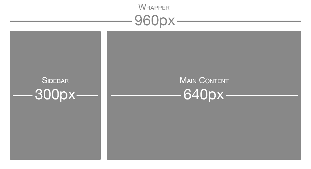
Using the same formula, each part of the site would have the following values:

  • Sidebar: 300px / 960px = 31.25%
  • Main Content: 640px / 960px = 66.66667%
  • Margin: 20px / 960px = 2.08334%

These percentage values can then be used in CSS simply by applying them to the width, margin, and padding properties. Here’s an example I created on CodePen demonstrating what that might look like in HTML and CSS.

FLUID IMAGES

There have been many advances in responsive images (detailed later in this post), but the core idea is that images should be able to shrink within the confines of a fluid grid. This can be done very simply with a single line of CSS code:

img { max-width: 100%; }

This will tell the browser that any images should only ever be as large as their pixel value, which will ensure that the image is never stretched or pixelated. However, if they’re nested inside a parent container that’s smaller than their pixel value, then the image should shrink. So for example, if an image with a width of 800px is placed inside a container that’s only 600px wide, the image will also shrink to be 600px wide. The height will be calculated automatically and will maintain the original aspect ratio.

MEDIA QUERIES

If you take our original two column layout and try to shrink it down to a mobile phone, it’s a bit challenging. Typically smartphones are used in portrait mode, meaning that the screen is taller than it is wide. This lends itself to websites that scroll vertically, but it’s not good for wide layouts with several columns. That’s where media queries come in. Media queries are a CSS technology that have been available in browsers for several years now, and they’re a core component of responsive design. Media queries allow CSS to only be applied when specific conditions are met. For example, you could write a media query that will only applies CSS if the browser reaches a specific width. That means that when a design is too large or too small, a media query can be used to detect the site width and serve CSS that appropriately rearranges the site’s content. Using the previous two column layout as an example, let’s say that we want to move the sidebar up to the top on mobile screen sizes. It’s actually better to do this by creating the mobile styles first and then using the media query to apply styling for the larger size (this is called a mobile first approach, which we’ll dig into more in a moment). The media query to do that might look like this:

@media screen and (min-width: 600px) { /* ...desktop styles here... */ }

Additionally, here’s a modified version of the previous CodePen embed so that you can see what this looks like in context. Please note that unless you resize your browser window to a smaller screen size (or you’re on a mobile device) this will look the same as the previous example.

See the Pen Basic Mobile First Design Example by Nick Pettit (@nickpettit) on CodePen.

At a certain point, any fluid grid layout will start to “break” and no longer look good. For example, if a mobile layout that takes up 100% of the browser width were stretched to a desktop size, the space wouldn’t be very well utilized. The point at which a layout no longer looks good is called a breakpoint. Responsive sites define their breakpoints through a series of media queries. In general, responsive code might look something like this

/* ...mobile styles here... */
@media screen and (min-width: 600px) { /* ...tablet styles here... */ }
@media screen and (min-width: 900px) { /* ...desktop styles here... */ }

This is just a small example. In practice, you might have many more media queries at sizes that are appropriate for your content. While I recommend using your site’s content as a guide for creating these breakpoints, screensiz.es has the best listing I’ve seen of device resolutions, just in case you need it.

Mobile First

Even before the start of the responsive design revolution, the idea of using a “mobile first” approach started to take hold. Mobile first is the idea of designing the smartphone experience first and then working upwards to tablets, desktops, and possibly beyond. In the now famous Mobile First post from Luke Wroblewski, there are several reasons given:

  • Mobile web browsers represent a rapidly growing demographic and will likely eclipse desktop browsing (if it hasn’t happened already)
  • Small mobile screen sizes force designers to focus, because there’s no room for sidebars, ads, social media buttons, and other peripheral content
  • Mobile devices typically have more capabilities than their desktop counterparts, such as touchscreens, GPS, accelerometer data, and more

Designing a responsive site with a mobile first approach is a natural evolution of both ideas. As demonstrated in the previous example, it can be tricky to cram a multi-column layout into a smaller screen space. Instead, it’s much better to start simple, then work upwards to more complex designs. In fact, creating a mobile experience first may benefit the desktop layouts as well, because the user experience will naturally be more focused.

Responsive Front-End Frameworks

Front-end frameworks like Foundation and Bootstrap have been around for some time, but more recently they’ve become responsive frameworks. In other words, their grids have responsive design in mind from the start. This is a huge step forward, because most of the time you don’t need to do any fluid grid calculations at all. Rather, the responsive grids included with a modern front-end framework just works immediately.

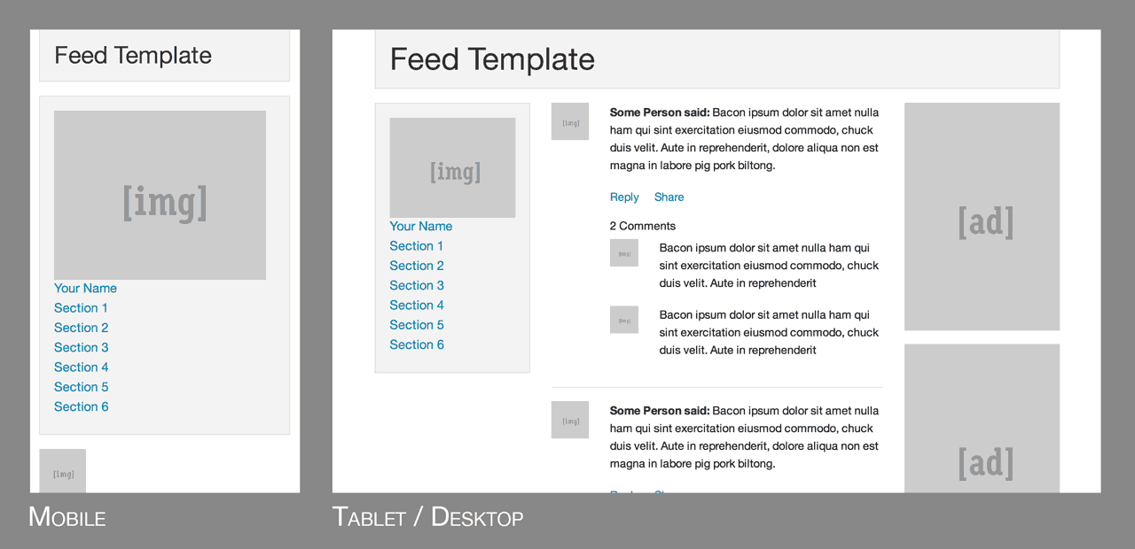
As an example, take a look at this template from Foundation:

Screenshot of mobile and tablet/desktop layouts from ZURB Foundation template.

Unless you’re building an extremely simple 1-page website, it’s almost always a smart idea to pick a front-end framework to start out with, even if it’s just for rapid prototyping. The responsive grids in these frameworks are very robust and thoughtful, so there’s no need to “reinvent the wheel” and start over.

Responsive Images

Beyond just multiple screen resolutions, web designers now have the added challenge of multiple pixel densities. Phones, tablets, laptops, and even some desktops, might have 2x or even 3x the number of pixels. In my own opinion, I think the best way to handle high DPI displays is to use an SVG first approach. In other words, anything that’s not a detailed photograph or illustration should be an SVG, because they can scale to any resolution and the file sizes are typically small.

If photographs or any kind of JPEG images are required (and they almost always are), typically you can get away just making them twice the size of their parent container. So for example, if the parent is 400 pixels wide, the image inside should be at least 800 pixels wide. This same trick works for background images when the background-size property is set to 50% or less.

However, if you need something more robust for lots of images, it’s worth investigating newer responsive image solutions. The Responsive Images Community Group has been working towards a client-side solution that comes in the form of both the <picture> element and the srcset attribute for the <img>element. Browser support is still far off, but they also offer a JavaScript polyfill that lets you use these features today.

Xamarin Apps share code across all platforms.

Target iOS, Android, Windows and Mac with a single, shared C# codebase. Use the same language, APIs and data structures on every platform.

C# is the best language for mobile app development.

With Xamarin, you write your apps entirely in C#, sharing the same code on iOS, Android, Windows, Mac and more. Anything you can do in Objective-C, Swift or Java, you can do in C#.

Native UI, native API access & native performance.

Xamarin apps are built with standard, native user interface controls. Apps not only look the way the end user expects, they behave that way too. This can’t be achieved with other solutions.

http://xamarin.com/

Scroll Top